Hue
tongue-in-cheek wordplay mixed with an excellent use of colours
With a striking blue facade and an oxidised turquoise metal door along a bustling stretch of restaurants in Jalan Besar is HUE, a newly established Thai fusion restaurant. Its bold exterior belies the neutral colour palette it has, with pops of colour appearing in various corners unexpectedly.
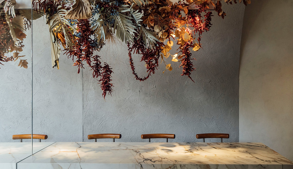
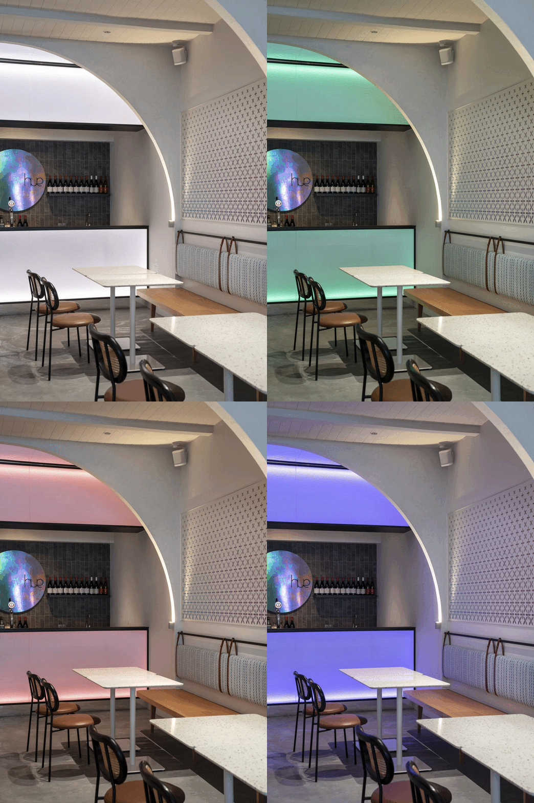
The wide arches in the space create a cave-like experience for all, providing patrons with a cosy and intimate atmosphere to dine and spend time with their loved ones in. The walls are lined with HUE's rainbow-coloured motifs, while the multi-coloured neon lights that change with every new day - both reiterate the inspiration its name was derived from.


HUE is a lifestyle destination that redefines the modern Thai dining experience with simple tweaks and unique twists. The logo represents a closely knitted Thai community where people are always warm and friendly. This representation is assimilated into HUE’s typography by intertwining the three letters. The letter “e” has a symbolic meaning of an elephant which is the official national animal of Thailand.


